NoodleDoodle - UX Case Study
–– Design a menu & ordering app and responsive website for a food truck
Year
2022
Client
NoodleDoodle
Roles
Design • UX • UI
Noodle-Doodle is a food truck company specialized in Italian pasta that runs in the city of Berlin. Noodle-Doodle makes amazing healthy and freshly made pastas, they also offer some starters and desserts for the hungrier ones. Noodle-Doodle targets customers such as students or workers, with little time to eat and who enjoy eating out.
Featured in The Best Easy To Use App Designs by DesignRush's Best Designs Trends.
The problem
Workers and students who want to eat outside and don't have much time to wait in a line for ordering and picking up food.
The goal
Design an app and responsive website for Noodle-Doodle that allows users to easily order and pick up fresh made pasta meals.
My role
UX designer: designing an app and a responsive website for Noodle-Doodle, from conception to delivery.
Responsibilities
Creating personas, user stories and user journeys. Brainstorming. Conducting interviews. Paper and digital wireframing. Low and high-fidelity prototyping. Visual designs.Conducting usability studies. Accounting for accessibility.
Understanding the user
I conducted user research to help bridge the gap between customers who want tasty, convenient and fast food and food truck owners, who want to reach more customers. I did four qualitative interviews with users, exploring their experience with food trucks and how they order and pick up food. This helped me understand the needs, behaviours and motivations of the users I’m designing for and to get the insights.
At first I didn't think that the usability of the app and of the website was very important, but the product itself. After the interviews I realized that the process (ordering easily and quickly) is equally or more critical for the business.
Research findings
Time
For many workers, there is no time to wait in lines or for long menu preparations.
Language barrier
In Berlin there are many foreigners who do not know the language. Sometimes they don't even need to because English is so widely spoken.
Clarity
It is important to know what ingredients and allergens are in the menus and that there are no errors in the orders.
Variety
A varied and not boring menu, but not too big, people want to decide quickly what they want.
Personas
Based on the research findings from the user interview, I created proto-personas or names that would play a crucial role in the rest of the design process. These personas would enable us to evaluate and reconsider all design decisions, while keeping the user and their perspective in mind.


Insights
- Users need information about the meaning and functionality of the groups feature.
- Users need a more intuitive way to select a foodtruck.
- Users need to know which foodtruck the meals on the home screen belong to.
- Users want to be notified when a food truck is near them.
Information Architecture
Information architecture is a visual representation that illustrates all the features available on the platform and how users can quickly and easily access any relevant information. Website navigation have to be easy and straightforward.
During the creation of this architecture, I incorporated the feedback obtained from user testing. My goal here was to make strategic information architecture decisions that would improve overall website navigation. The structure I chose was designed to make things simple and easy.

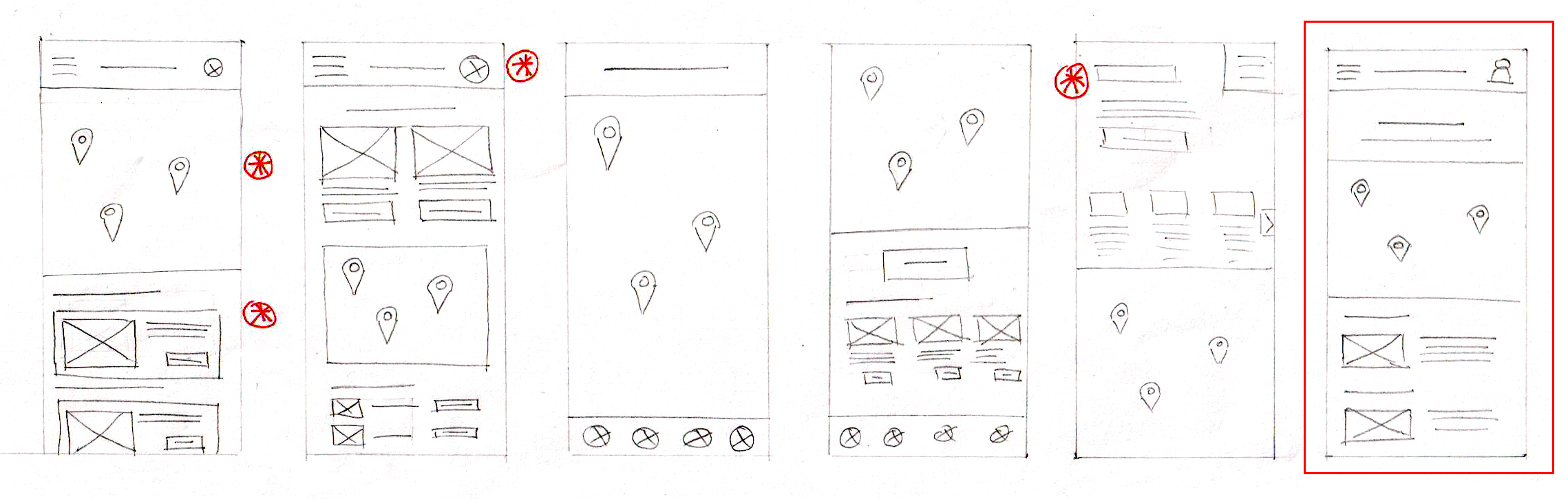
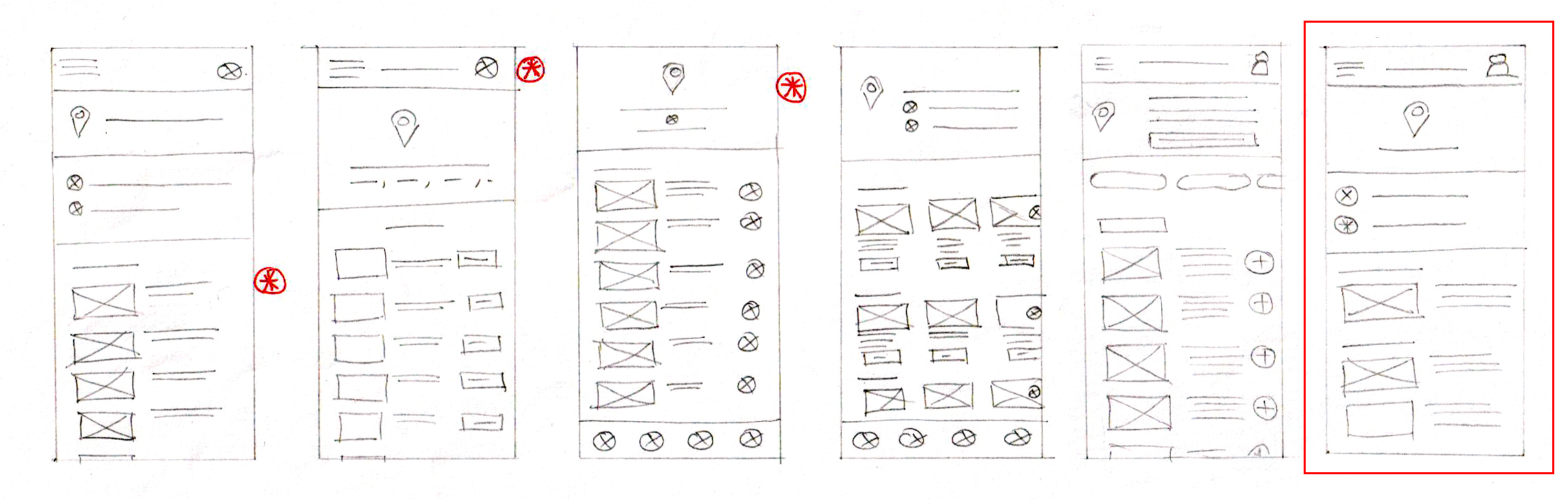
Paper wireframes
After compiling a list of all the required screens, I began sketching multiple versions of each screen to refine the design. My focus was on creating a fast and stress-free user experience by prioritizing simplicity and a streamlined ordering process during the sketching phase.


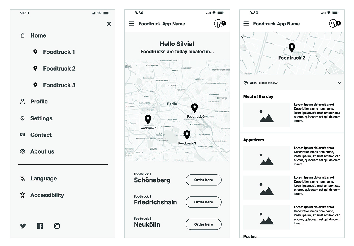
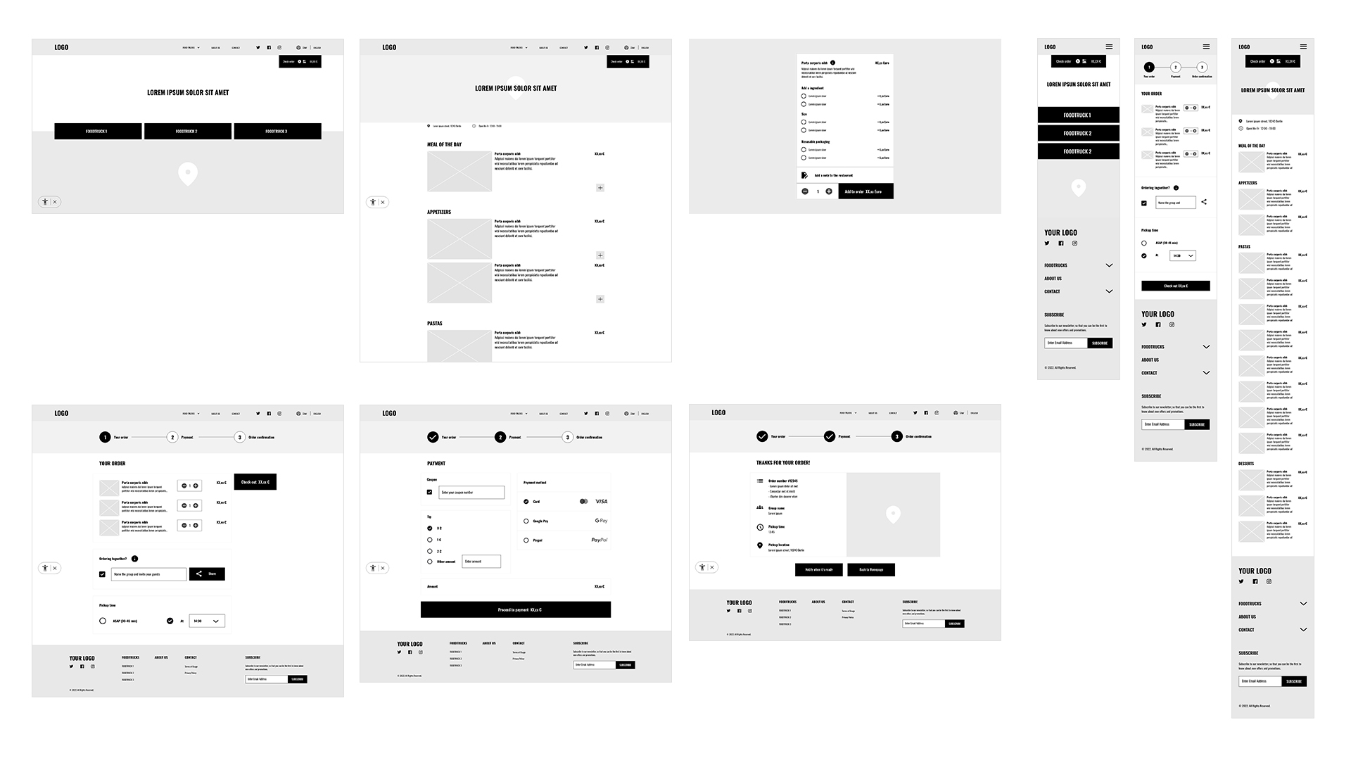
App digital wireframes
As I transitioned to the digital phase of the design process, I made certain that my designs incorporated feedback obtained from my research. Moving to digital wireframes made it easy to understand how the redesign could help address user pain points and improve the user experience.
After developing the wireframes digitally using Figma, I proceeded to conduct user testing.
View the low-fidelity prototype here.


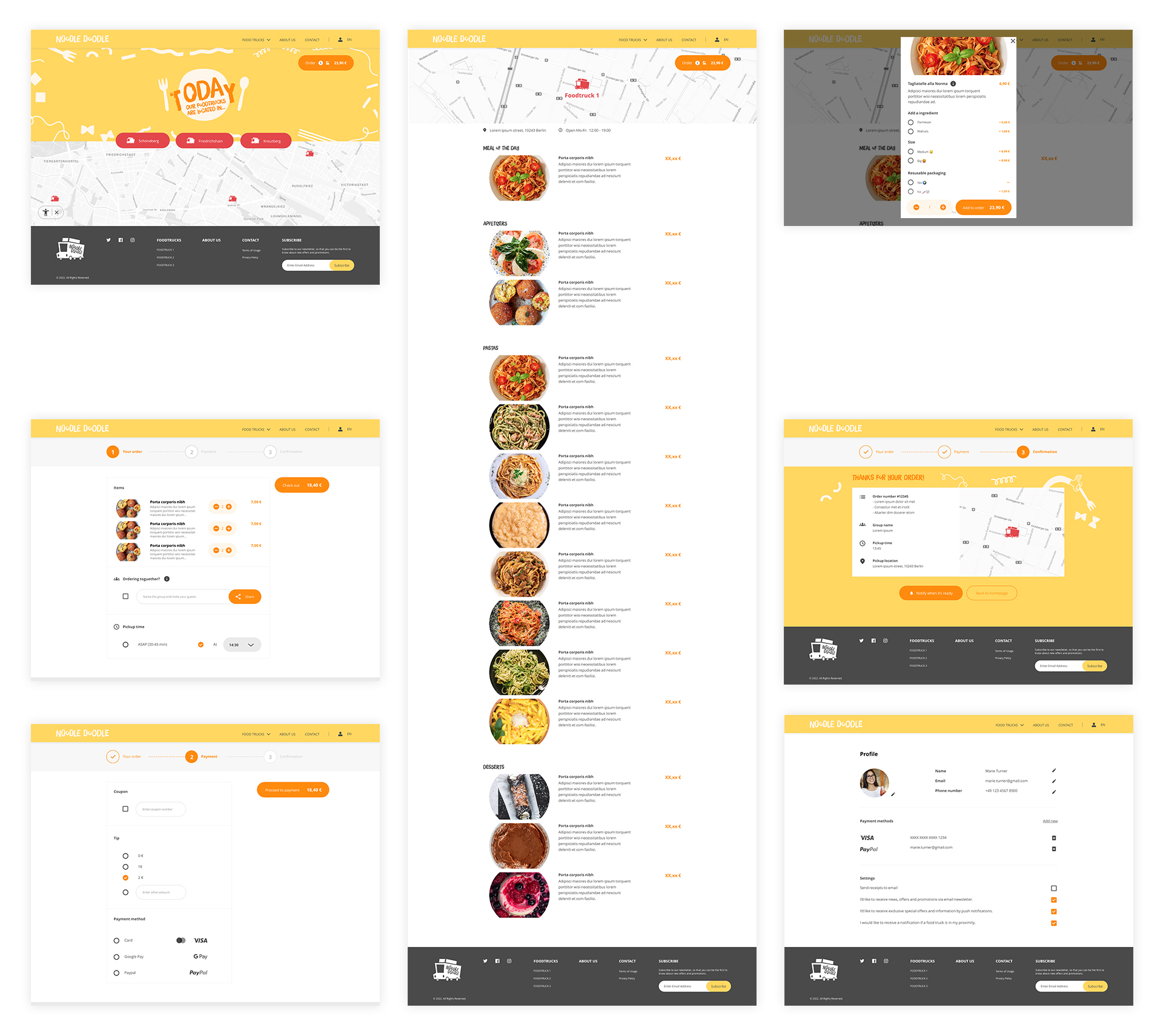
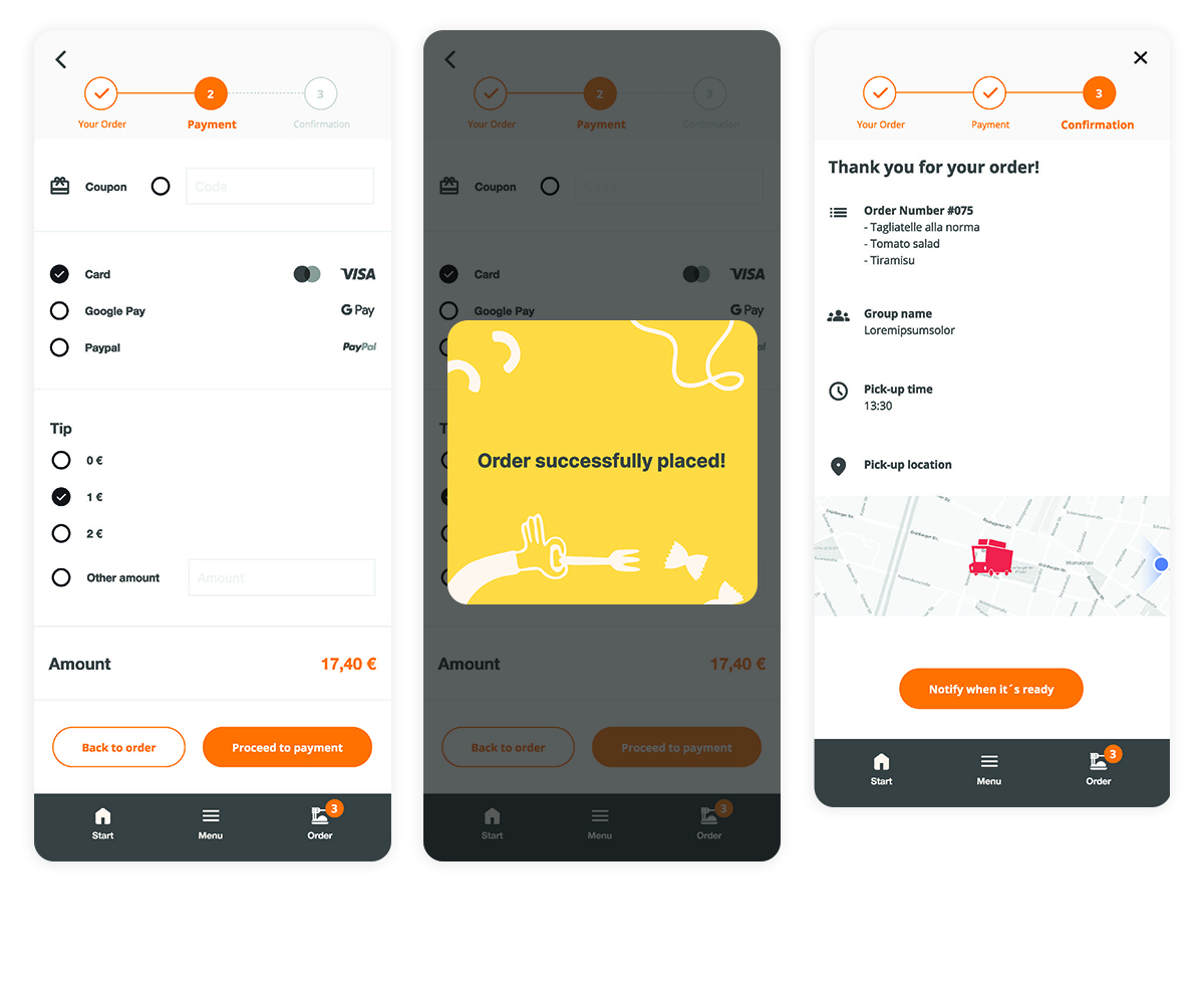
Hi-Fi Screens and prototype
As the design process progressed, a high fidelity design was developed to capture the appearance and feel of the product. In contrast to the placeholders used in low-fidelity wireframes, high-fidelity designs include real content, fonts, colors, effects, and branding elements. The design was refined and made more visually appealing.
An interactive high fidelity prototype of the app was created using Figma. Then, I conducted testing on the design to observe how users interacted with the app, creating an experience that closely resembled a real-life interaction with the final product.
There were two small usability issues, which were solved and this is the final result.
View the high-fidelity prototype here.


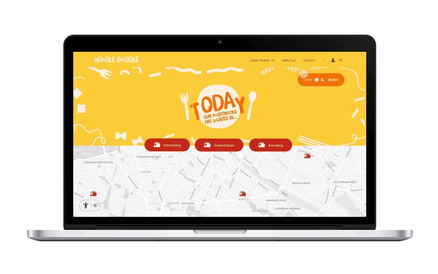
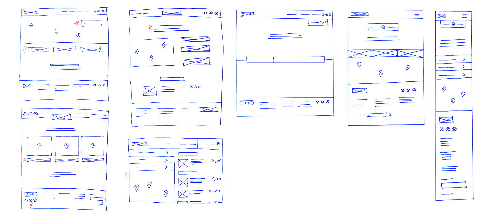
Website digital wireframes
For the design of the web wireframes I used Adobe XD, in order to experience and compare the two programs for the same purpose.
View the low-fidelity prototype here.

Hi-Fi Screens and prototype
In the case of the web I kept using Adobe XD for the mockups and the high fidelity prototype. Afterwards, I also performed usability tests, such as with the app. I evaluated the design and user interaction with the application, creating an experience that closely reflected the real life interaction with the final product.
View the high-fidelity prototype here.